
The year 2019 has breathed new life into Belmar, with a complete overhaul of the company's graphic identity and the launch of a modernized website, version 2.0!
In almost forty years, the company's visual identity has evolved considerably, undergoing a metamorphosis over the years as the company has grown and opened up to new business sectors.
1978 - 2004: Strong roots in Brest's commercial port
At the end of the seventies, Belmar was known as Bellion Marine. The company, based in Brest's commercial port, was then just a modest shipchandler with two employees. As a supply specialist, its mission was to refuel merchant ships calling at the tip of Finistère.
Bellion Marine takes the name Belmar, which is then symbolized by an anchor, a strong icon symbolizing the spare parts and other fittings supplied by the company. A modern, elaborate anchor, twisted to form a "B", the initial of "Belmar" and of the "Bellion" family, at the head of the company. The logo was invented by Michel Bellion, who later became a naval painter.

2004 - 2014: Deployment of Belmar's Offshore activity
Following a fruitful partnership with an oil rig, Belmar's business opened up to the world of the offshore industry. The company seized on this opportunity and, at the same time, rethought its graphic identity for the first time.
The marine anchor gave way to an oil platform. Belmar's positioning became more refined and assertive, with an offer targeted at "Oil & Gas" customers. This new identity is adorned with the colors red and blue, the former referring to the flames escaping from platforms during flaring (combustion of fossil gas emissions linked to oil and natural gas exploitation), and the latter to the hue of the ocean. The company exported to Dubai in 2004, bringing with it an Arabic version of the logo.


2015 - 2019 : Towards a more universal identity
Now firmly established in the Offshore world, Belmar is keen to open up to other fields of activity. Over the years, the company's offer has diversified to include new partners in the marine, agri-food, aeronautical and aerospace sectors...
In keeping with these new ambitions, the company's logo has been redesigned to adopt a more universal approach. While the original colors were retained, the illustration of the oil rig disappeared, to make room for the Belmar company name, embodying a more neutral positioning, ready to open up to new business opportunities. In 2016, Belmar decided to export its know-how to the American continent, in order to boost its international development and win over new customers. The American subsidiary BelQuest was born in Houston, Texas.
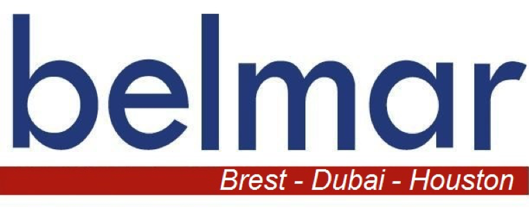
2019 : A breath of fresh air
2019 marks a turning point for the Cofibel Group, of which Belmar is a subsidiary. The century-old group, run by the Bellion family, is giving itself a new graphic identity, in a bid to modernize. This facelift also benefits its five subsidiary companies. To ensure unity between the Group and its subsidiaries, the new logos follow the same graphic rules. Nevertheless, they must be differentiated from one another by a strong visual element. For Belmar, which has long struggled with its identity and image, this symbol will take the form of a seabird, and not just any seabird: the albatross.
The new Belmar logo is built around this animal totem. Synonymous with endurance, long-distance travel and power, the albatross embodies a number of values with which the company identifies and which link it to the sea, its primary element (references to the marine anchor and the oil rig). Belmar's credo is to be able to cross seas and continents to deliver to its customers, providing them with an agile, tailor-made solution!
